Advanced Typography - Task 3: Type Exploration and Application

22/9/2025-19/5/2025 / Week1-Week5
Tan Tzu Yu / 0374460
Typography / Bachelor of Design (Honors) in Creative Media / Taylor's University
Task 3 / Type Exploration and Application
INSTRUCTIONS
<iframe src="https://drive.google.com/file/d/1tMdu3vZ8WVN9ZHfHrhrCRiu8TkwcYiBZ/preview" width="640" height="480" allow="autoplay"></iframe>
Task 3 : Type Exploration and Application
FEEDBACK
Week 9
Specific Feedback : For Idea 1, I need to approach the design more subtly. Right now, the poker card elements (spades, hearts, etc.) aren’t very clear. Instead of only creating additional letters based on the album’s existing style, I should expand the concept by incorporating more recognizable poker card elements — for example, using the shapes more prominently.
General Feedback : It’s important to remember that the heart of this task is to go beyond simple letter creation — we’re either expanding an existing typeface meaningfully, designing a font that tackles a bigger design or communication problem, or exploring an experimental direction that challenges conventional type design.
Week 10
Specific Feedback : The uppecase letters looks okay but the numbers have different size strokes from the uppecase letters, it should be the same so work more on it.
General Feedback : It’s important to remember to record the whole process while designing our typefaces.
Week 11
Specific Feedback :
General Feedback :
Week 12
Specific Feedback :
General Feedback :
Week 13
Specific Feedback :
General Feedback:
Week 14
Specific Feedback :
General Feedback:
REFLECTIONS
Week 9:
Experience : I explored different ways to integrate poker card elements into my typeface and tried adjusting my idea to be more subtle yet recognizable.
Observations : I noticed that my initial design didn’t clearly communicate the card theme, and the shapes like hearts and spades were not obvious enough.
Findings : I learned that expanding a typeface requires meaningful visual cues and a stronger concept, not just adding letters that match the existing style.
Week 10:
Experience :
I continued refining my typeface, focusing on improving consistency between uppercase letters and numbers.
Observations :
I noticed that the numbers looked visually disconnected from the uppercase letters because their stroke thickness was inconsistent. This made the typeface look unbalanced when placed together. I also observed that small differences in proportion and weight can affect the overall readability and cohesiveness of the design.
Findings :
I learned that type design requires careful attention to detail, especially when ensuring that all characters share the same visual rhythm. Consistency in stroke size, proportions, and style is key to creating a unified typeface. I also realised the importance of documenting every step, as it helps track changes and understand how each adjustment improves the design.
Week 11:
Experience :
Observations :
Findings :
Week 12:
Experience :
Observations :
Findings :
Week 13:
Experience :
Observations :
Findings :
Week 14:
Experience :
Observations :
Findings :
FURTHER READING
Stop Stealing Sheep & Find Out How Type Works – Erik Spiekermann & E.M. Ginger
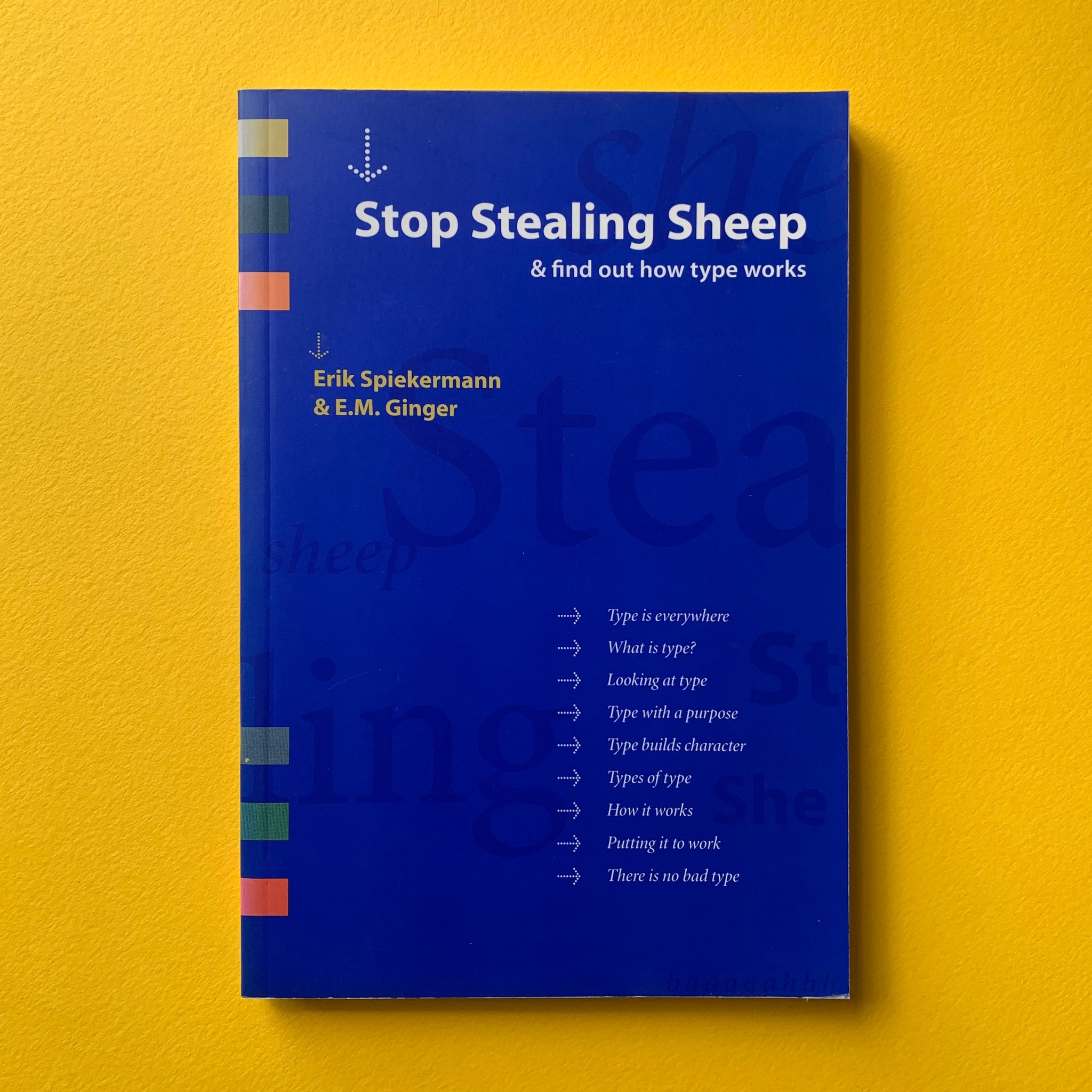 |
| ( Fig. ? : Stop Stealing Sheep & Find Out How Type Works by Erik Spiekermann & E.M. Ginger) (Uploaded on 13/10/2025) |
This book is the fun, witty side of typography. Where Bringhurst feels like poetry and Lupton feels like a manual, Spiekermann feels like a friend sitting next to you, cracking jokes while teaching you why type matters. The quirky title comes from type designer Frederic Goudy’s famous line: “Anyone who would letterspace lower case would steal sheep.”It’s a playful way to remind us that type isn’t just decoration — it’s a tool with personality, tone, and real impact.
It was first published in 1993, the book mixes humor, visuals, and metaphors to make type approachable. It covers the basics — type anatomy, spacing, readability, history, and design choices — but in a way that never feels heavy or academic. Instead of drowning you in theory, it makes type human. Letters stop being abstract shapes and start becoming characters with moods, voices, and styles — almost like outfits you dress your words in.
The format is lively, filled with quirky visuals, sidebars, and real examples that make it fast to read and easy to remember. You’ll learn why typography changes how people feel, how to pick fonts that say the right thing, and how even small details like spacing affect clarity.
For design students, this book is perfect when you’re overwhelmed by serious rules or philosophy. It reminds you that type can be expressive, fun, and approachable — something you play with as much as you work with. It’s often the book that makes people fall in love with typography for the first time.


Comments
Post a Comment