
13/10/2025-18/11/2025 / Week5-Week8
Tan Tzu Yu / 0374460
Typography / Bachelor of Design (Honors) in Creative Media / Taylor's
University
Task 2 / Key Artwork & Collateral
LECTURES
Week 5: Preception & Organisation
Perception is “the way in which something isregarded, understood, or
interpreted.”
Preception in typography deals with the visual navigation and
interpretation of a reader via contarst, form and organisation of the
content. Content can be textual, visual, graphical or in the form of
colour.
[Contrast]
Contrast in typography is essential for distinguishing different types
of information. Without it, readers may struggle to separate and
understand the content.
Methods of Creating Contrast:
-
Size: Using different font sizes to draw
attention. For example, we will obviously see the big letter first before the
small so headings are typically larger than body text.
-
Weight: Variations in font weight (bold vs.
light) can emphasize certain text elements.Besides, rules, spots, squares are used as “heavy area” for a
visual attraction or emphasis.
-
Form: Differentiating between uppercase and
lowercase letters or using various typeface styles.
-
Structure: Structure means the different letterforms of different kinds
of typefaces.The design of letter forms, such as serif vs. sans serif, can
create visual interest.
-
Texture: The overall appearance of text when
viewed up close or from a distance contributes to the visual
texture of a layout.This depends partly on the letterforms and the
arrangement.
-
Direction: Contrast of direction is the opposition between vertical,
horizontal, and the angles in between. Mixing vertical
and horizontal text can create dynamic layouts.
-
Color: A second color is often less emphatic in values than plain
black on white. Therefore it is important to give thought to
which element needs to be emphasized and to pay attention to
the tonal values of the colors that are used. Thus, it
is important to evaluate which elements that need to be pay
attention.

|
Fig 1.0: Type of Contrast (by Rudi Ruegg)
(Uploaded on
21/10/2025)
|
Fig 1.1: Type of Contrast (by Carl Dair)
(Uploaded on 21/10/2025)
[Form]
Form refers to the overall look and feel of the elements that make up the
typographic composition. It is the part that plays a role in visual impact
and first impressions.
A good form in typography tends to be visually intriguing to the eye; it
leads the eye from point to point, it entertains the mind and is most
often memorable.
Typography can be seen in 2 function: Represent a concept and a visual
form
When a typeface is perceived as a form, it no longer reads as a letter.
Instead, it has been manipulated by distortion, texture, enlargement, and
has been extruded into a space.
Fig 1.2: Examples of Forms
(Uploaded on 21/10/2025)
Fig 1.3: Form with good communication
(Uploaded on 21/10/2025)
[Organisation and Gesalt]
Gestalt theory emphasizes that the whole is greater than the sum of
its parts. In design, this means that individual elements must work
together cohesively to create a unified visual experience.
Fig 1.4: Gesalt Principles of Grouping
(Uploaded on 21/10/2025)
1) Law of Similarity
It states that humans tend to perceive elements that are close to each
other as belonging together, spatial arrangement of visual elements
influences our perspective of their relationship and grouping

|
|
Fig 1.5: Law of Similarity
(Uploaded on 21/10/2025)
|
2) Law of Proximity
It states that elements that are close together tend to be perceived as a
unified group whereas items further apart are less likely to be grouped
together.

|
|
Fig 1.6: Law of Proximity
(Uploaded on 21/10/2025)
|
3) The Law of Closure
It refers to the mind’s tendency to see complete figures or forms
even if a picture is incomplete, partially hidden by other objects, or
if part of the information needed to make a complete picture in our
minds is missing

|
|
Fig 1.7: Law of Closure
(Uploaded on 21/10/2025)
|
4)Law of (Good) Continuation
It states that humans tend to perceive each of two or more objects as
different, singular, and uninterrupted object even when they intersect.
The alignment of the objects or forms plays a major role for this
principle to take effect.

|
|
Fig 1.8: Law of Continuation
(Uploaded on 21/10/2025)
|
5) Law of symmetry
It explains how humans perceive visual elements as balanced when they
are arranged in symmetrical or follow a predictable pattern.
INSTRUCTIONS
<iframe
src="https://drive.google.com/file/d/1tMdu3vZ8WVN9ZHfHrhrCRiu8TkwcYiBZ/preview"
width="640" height="480" allow="autoplay"></iframe>
Task 2: Key Artwork & Collateral
Task 2(A) : Key Artwork
A key artwork is
basically a design that represents our name — it’s both a wordmark or lettering and also a piece of visual art. In this task, the key artwork acts as our personal identity mark,
but it can also be used creatively on different items
like pins, T-shirts, or posters. What makes it special is that it can be broken down into smaller
shapes to create vibrant patterns, helping to strengthen and expand our overall visual identity.
For this project, we’ll be experimenting with different versions and arrangements of our name to explore what works best visually. The final
key artwork should feel balanced, elegant, and easy to understand — something that’s visually striking but not overly
complicated. Later, this design will be used again in Task 2(B) to create collateral items.
[Mindmap]
Before starting this task, we were asked to explore and reflect on
ourselves by creating a mind map. This helps to brainstorm ideas, concepts, and keywords that
represent who we are — things that can later inspire and guide the
design of our personal brand. For this project, I’ll be using my own
name, Tzuyu, as the main focus and identity of my wordmark design.

|
|
Fig 2.0: My mindmap (Uploaded on 22/10/2025)
|
[Moodboard]
I created a mood board by gathering a collection of inspiration
images that served as visual references for my wordmark design. At
this stage, I felt somewhat indecisive and unsure about which keywords
best represented me. However, I knew that I wanted my wordmark to
convey a playful and wavy character. Developing the mood board helped
me refine my vision, guiding me toward the overall tone and aesthetic
direction I wanted to pursue.

|
Fig 2.1: My moodboard(Uploaded on 22/10/2025)
|

|
|
Fig 2.1.2: Idea exploration(Uploaded on 22/10/2025)
|
[Sketches]
From my mind map, I selected four key words — friendly, fun personality, ocean, and bubble wrap, but then Mr Vinod said that the keywords are too broad's I
refined it and come out with a better keywords -Dreamy, Warm-hearted, Playful, Fun and Friendly. These inspired me to explore a concept that felt bubbly and wavy,
reflecting the cheerful and fluid nature suggested by the
keywords friendly, fun, and ocean. Using these ideas as a foundation, I sketched several variations
of my wordmark, experimenting with forms and flow to express the
playful energy I envisioned.

|
|
Fig 2.3: My sketches (Uploaded on 22/10/2025)
|

|
Fig 2.3.1: My 5 finalized wordmark design (Uploaded on
22/10/2025)
|
[Digitalisation]

|
|
Fig 2.4 : Chosen wordmark (Uploaded on 22/10/2025)
|
|
The wordmark shown above is my selected design from the five
initial explorations. Mr. Vinod mentioned that he liked the
overall shape and flow of the wordmark, but pointed out that its
readability could be improved. Specifically, the
linked Z and U resembled a W, while the final U appeared more like an S. Based on his feedback, I refined the design and developed a
clearer, more balanced final version of my wordmark.

|
Fig 2.4.1: wordmark refinements
(Uploaded on
29/10/2025)
|

|
Fig 2.4.2: Final version of my wordmark
|

|
|
Fig 2.4.3 : word mark on t-shirt
|

|
|
Fig 2.4.4 : word mark in different colors
|
|
|
Fig 2.4.5 : word mark in different colors (PDF)
|
[Wordmark Animation]For my wordmark animation, I wanted to create a floating or melting effect, as the wavy form of my wordmark already gives a soft, fluid impression. I began by focusing on colour — using cream and orange to evoke warmth, which is one of my key concepts from the mind map. These tones also complement the idea of melting. In the first four seconds, the wordmark appears alive, gently floating and subtly expanding and contracting as if it’s breathing. In the final four seconds, it transitions into a melting motion, emphasizing the organic and playful nature of the design.
| Fig 2.5 : Wordmark Animation_First attempt (GIF) In the second attempt of animating the wordamrk, I try to make the first 4 seconds of breathing effect much obvious by adjusting the scale of the wordmark.
|
 |
| Fig 2.5.1 : Wordmark Animation_Second attempt (GIF) |
Task 2(B) : Key Artwork & Collateral
[Collaterals]
For the collaterals I want my brand identity to be a brand that
promotes self-love, so it focused on selling products like skincare,
candles and more. Then, I came out with a catchphrase “A little ritual
for your soul.” as my brand tagline.
These are my ideas for the mockup:
- T-shirt
- Candles
- Face cream
-
Travel size skincare set
-
Affirmation cards

|
|
Fig 2.6.1 : Instagram posting grids
|
|

|
|
Fig 2.6.2 : Collaterals and Instagram page
|
|
|
Fig 2.6.3 : Collaterals and Instagram layout and page
|
Final Submission
[Wordmark]
 |
Fig 3.0: White wordmark with black background
|
 |
Fig 3.1: Black wordmark with white background
|
 |
Fig 3.2: Color Palette
|
 |
Fig 3.3: Wordmark in actual color
|
 |
Fig 3.4: Wordmark with darkest background
|
|
| Fig 3.5 : Wordmark Animation(GIF) |
[Collateral]
 |
| Fig 3.7 : Collateral 1 |
 |
| Fig 3.8 : Collateral 2 |
 |
| Fig 3.9 : Collateral 3 |
 |
| Fig 3.10 : Collateral 4 |
 |
| Fig 3.10: IG screen grab |
FEEDBACK
Week 5
Specific Feedback : Create more exploration sketches and define clear
keywords to guide your wordmark design. A mood board is also needed in
order to establish the overall tone and direction.
General Feedback : Be mindful of the spacing in your wordmark, as
too much space can affect readability and balance. When seeking
inspiration, explore multiple sources instead of relying on just one.
Week 6
Specific Feedback :
Readability and composition are key aspects to consider. While my
design is unique, the legibility could be improved — particularly
in how the letters connect. In TZUYU, the linked Z and U resemble a W, and the final U appears more like an S, which affects clarity. Additionally, the keyword “ocean” feels too broad and doesn’t strongly communicate a specific
concept. It would be more effective to choose a more defined or
distinctive keyword that better represents the intended theme or
personality.
General Feedback :
When it comes to readability, it’s best to let someone who doesn’t
know our name or the ideas behind the wordmark try to identify it.
A good wordmark should be simple and clear enough for viewers to
instantly recognize what it represents or means, while still
maintaining a unique and distinctive appearance. After all, many
designers may share similar keywords or concepts, but the
execution and visual interpretation are what make each design
stand out.
Week 7
Specific Feedback : Collateral and animation must be
finished designing by this week as next week is the submisssion day.
General Feedback : When designing a collateral, we should always think
from multiple perspectives. Ask yourself: “Would I buy this design if
I were the customer?”, “Does it fit the overall theme?”, or “If I were
a designer or a company, what kind of product would I give as a PR
gift to build brand awareness?”
We should have enough confidence in our design that we’d proudly wear
our own wordmark on a t-shirt. If we hesitate to do so, it may be a
sign that the design isn’t strong enough or doesn’t truly represent
the brand’s identity yet.
Week 8
Specific Feedback : Mr vinod commented that everything looks great and good to go.
General Feedback : Mr vinod briefed us on how should we compile our work for submission and then we were also intoduced to task 3, he says that task 3 can be quite heavy but as long as we use our time properly, it will be okay.
REFLECTIONS
Week 5:
Experience :I explored more wordmark sketches and started developing a clearer
direction. Creating a mood board helped me better define the tone and
personality I wanted to express.
Observations :I noticed that unclear keywords made my designs feel inconsistent.
Adjusting spacing and studying more references showed me how balance
affects readability and overall harmony.
Findings : Clear keywords and a strong visual reference are essential before
sketching. They help guide style choices and make the wordmark more
cohesive and intentional.
Week 6:
Experience :
I refined my wordmark, focusing on improving readability and letter
connections, especially between “Z” and “U.” I also replaced the
broad keyword “ocean” with something more defined.
Observations :Small adjustments in spacing and letterform made a big impact on
legibility. Testing it with others helped me see how the design was
actually perceived.
Findings :
A successful wordmark balances clarity and uniqueness. Choosing more specific, personality-driven keywords gives my
design stronger meaning and direction.
Week 7:
Experience : . It was challenging to manage time, because I always need quite a
lot of time to come out with a idea so was quite hectic but im trying my best to finish it on time.
Observations : I realised that paying attention to small design details really helps
everything feel more cohesive.
Findings : Good design isn’t just about how it looks — it’s also about
confidence in what we create. If I wouldn’t proudly use or wear my own
design, it means there’s still room for improvement.
Week 8:
Experience : This week felt quite relaxing since my work was approved and ready to go. I felt more confident after hearing positive feedback from Mr. Vinod.
Observations : Most of us have printed our wordmark design on a t-shirt and wear to class, it is very fun and interesting to see everyone wearing their own design.
Findings : Good time management really makes a difference, and staying consistent helps prevent last-minute stress.
FURTHER READING
The Elements of Typographic Style – Robert Bringhurst
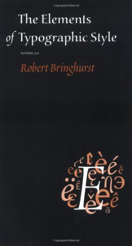
|
( Fig. ? : The Elements of Typographic Style by Robert Bringhurst)
(Uploaded on 5/10/2025)
|
The Elements of Typographic Style is written by Robert Bringhurst, a
Canadian typographer, poet, and translator. The book is often simply
referred to as “Bringhurst” by designers because of its reputation and
authority in the field. It is first published in 1992 by Hartley &
Marks Publishers, but it has been revised and expanded multiple times from
1996 to 2012, total 7 edition and each edition refining its insights and
adapting to the evolving landscape of typography. If Thinking with Type is
the hands-on manual, then The Elements of Typographic Style is the soulful
bible of typography.
The title itself is a clever nod to The Elements of Style by Strunk and
White — the classic guide to writing. Just as Strunk and White taught
writers how to think about words, Bringhurst teaches designers how to
think about type. He blends practical instruction, theoretical reflection,
and historical context into something that feels part textbook, part
philosophy, and part poetry.
Inside, Bringhurst covers a staggering range: the anatomy of type,
classifications, rhythm and proportion, grids, ligatures, page
composition, and even the cultural history of typefaces. But what makes it
different from other manuals is the way it’s written. Bringhurst doesn’t
just explain how to set type — he writes about typography the way a
composer writes about music. He describes spacing, rhythm, and proportion
in ways that make you feel typography, not just see it.
Because of this, the book isn’t just used by design students. It’s become
a house manual at many American university presses, a core textbook in
design schools, and a reference work in design studios all over the world.
It has been translated into Italian, Greek, and Dutch, cementing its place
as a global standard.


Comments
Post a Comment