DPI WEEK 7

2/6/2025 -
Tan Tzu Yu / 0374460
Group 2
Digital Photography & Imaging (GCD61204)
Weekly Post : Week 7
This week, we learned about colour theory — how colour works, how we see it, and how it affects the way people feel when looking at a design.
[RGB vs CMYK]
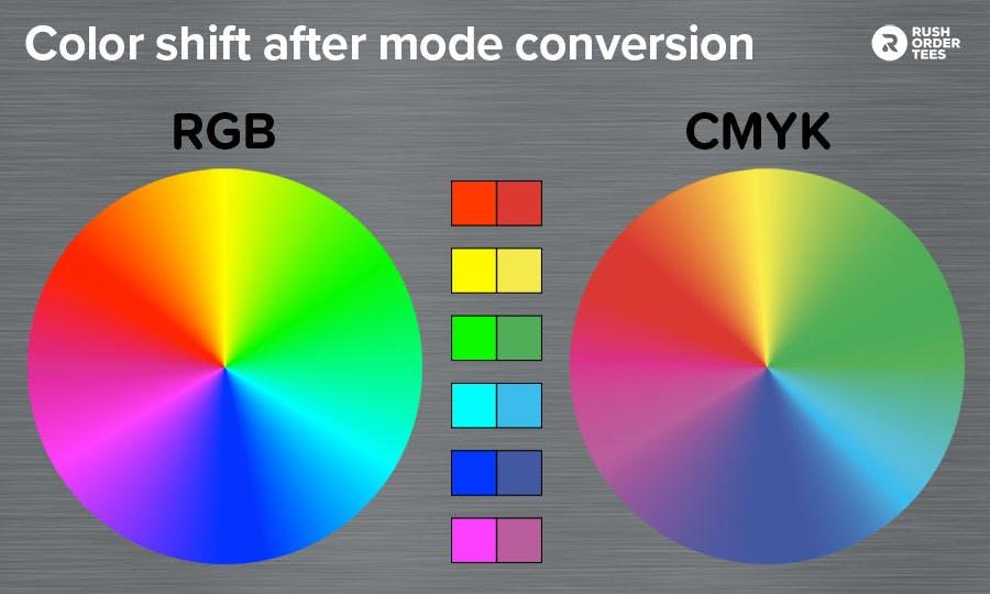 |
| Fig1.0 : RGB vs RMYK |
RGB (Red, Green, Blue)
Used for screens (like phones, laptops). Colours are made by adding light.CMYK (Cyan, Magenta, Yellow, Black)
Used for printing. Colours are made by subtracting light (using ink).
[Colour Basics]
Hue – the name of the colour (like red or blue)
Shade – hue + black (makes it darker)
Tint – hue + white (makes it lighter)
Tone – hue + grey (makes it more muted)
[Colour Harmony – Matching Colours]
Monochromatic – same colour in different shades/tints
Analogous – 3 colours next to each other on the colour wheel
Complementary – colours opposite each other (very bold)
Split-Complementary – one colour and two that are near its opposite
Triadic – 3 colours evenly spaced (like red, yellow, blue)
[Colour Psychology]
Warm Colours (red, orange, yellow): energetic, happy, urgent
Cool Colours (blue, green, purple): calm, relaxed, sometimes sad
Neutral Colours (black, white): classy, clean, simple
I also found the colour harmony part really useful. I didn’t realise there were so many ways to match colours, like triadic and complementary. Now I know how to make my designs more balanced or bold depending on what I want.
The most interesting part was colour psychology. It made me think about how certain colours can change the mood of a design. I’ll definitely start using colour more carefully now, depending on the message I want to send.


Comments
Post a Comment